Onconference web redesign

Overview
OnConference is a conference call service with toll-free access in 100+ countries. OnConference mostly serves enterprises as customers. The objective of was to redesign the website to serve both the business and customer’s needs.
PROJECT INFORMATION
Client: OnConference
Objective: Responsive Web Redesign
Duration: 2 Weeks
Tools: Sketch, Invision, Keynote
TEAM
Interaction Designer: Esther Nam
Project Manager: Emma McGee
User Researcher: Mark Hwang
CONTRIBUTions
Sketching
Wireframes
Usability Testing
Content Analysis
Competitive Analysis
Comparative Analysis
THE CHALLENGE
The challenge for this sprint was to better serve both OnConference customers and the company itself. Customers were dealing with issues navigating through the website, accessing essential information. The business was facing issues regarding low conversion rates, high bounce rates, etc.
Our Strategy & SOlution
Our approach to the problem was to discover OnConference customers characteristics and behaviors through user research. Our scope of the project was to design the pages for user sign up flow and restructure information architecture for OnConference, order to increase conversion.
RESEARCH
Between our researcher and myself, we were able to conduct research various tactics. There were various research steps that took place for this project.
Surveys
User Interviews
Usability testing of current app
Google Analytics auditing
Tracking maps
Affinity Mapping
KEY INSIGHTS
Through research, we were able to better understand our users, and gather some key insights.
Layout on the current site does not look reliable and outdated.
Pricing is unclear, especially for international countries.
Too much content and redundant information
Lack of clear instruction upon signing up
BRIAN TYLER | 30 | SCRIPT SUPERVISOR
Synthesizing all research, we were able to come up with our persona: Brian Tyler. Brian is a 30 year old Script Supervisor, who is always on the run due to his demanding job.
Values & Needs
Efficiency and simplification of instructions
Simpler ways to communicate
Tools that share information simultaneously
Frustrations:
Overly complicated and repetitive instructions
Misleading, spam-like content
Tedious payment process
How we can serve
Organized content and layout
Seamless checkout experience
Simplified features and functions

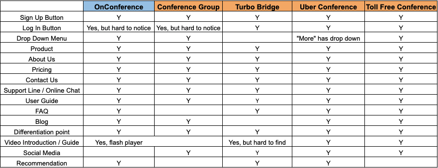
Chart created by Mark Hwang
COMPETITIVE ANALYSIS
As we completed the 2 week sprint, we began exploring next steps in order to push into launch. Post sprint, the team is continuing to work with OnConference to implement the redesign.
Improve SEO
Work on copywriting/instruction
Mobile responsive
Post-launch conversion data analysis
Show pricing in localized currency
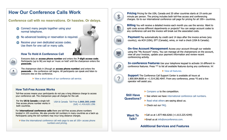
CONTENT ANALYSIS
Another important step we went through was content analysis.
Due to SEO, it seemed important for On Conference to use as many keywords as possible for ranking.
However, through testing, we found that users would much rather have clear instructions outlined and be able to sign up for the business, which ultimately results in better conversions.
In order to better tackle these issues, I continued on to make some exploratory sketches for both layout and content.
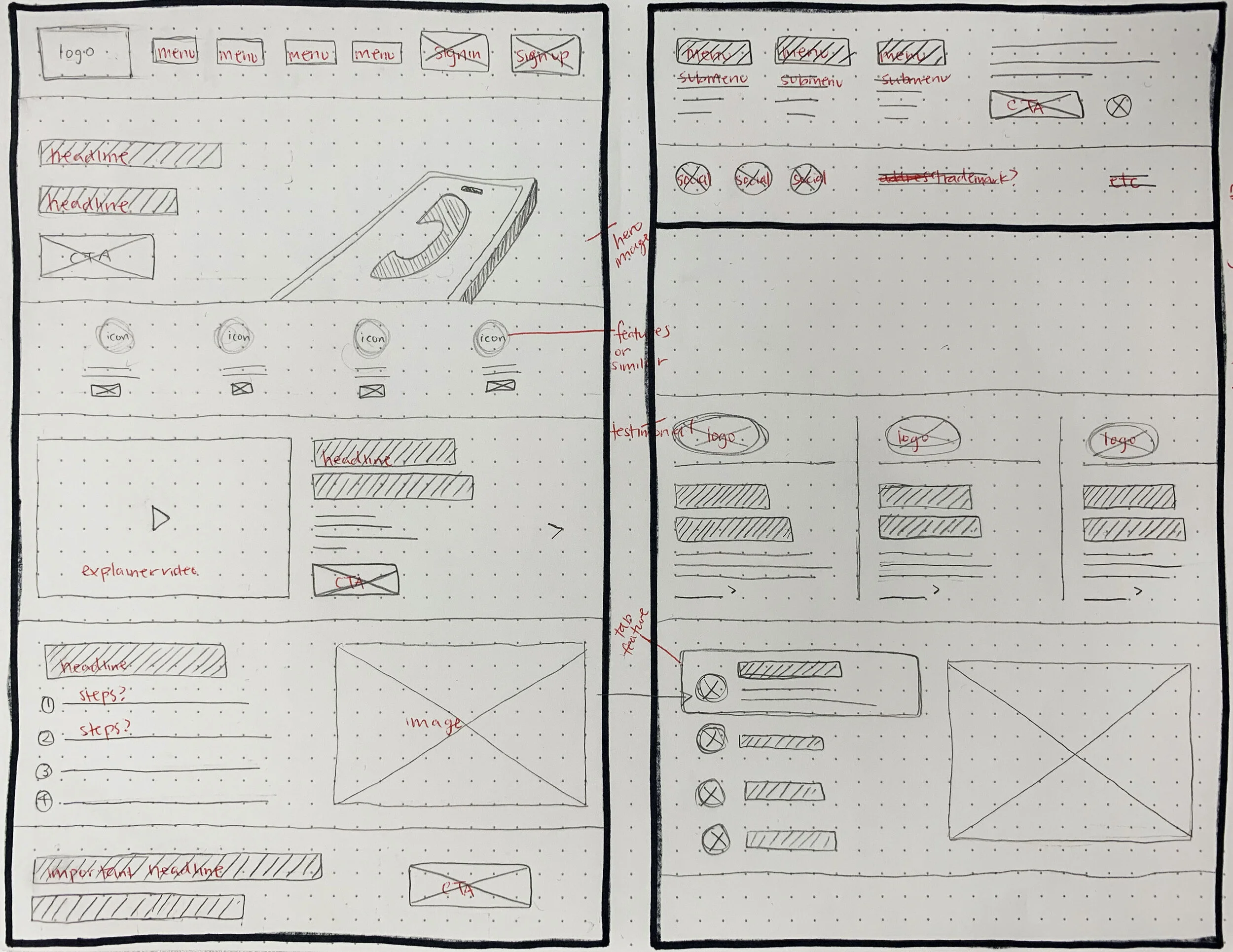
SKETCHES
I started with high-level exploratory sketches that could better serve our persona Brian, as well as onConference as a business.
Some main points I focused on were visually simplifying pages, content reorganization, and modernization.
To revisit what our researcher stated, pages we decided to redesign on are:
Homepage, product page, pricing page (aka Rates & Numbers)
Once we finalized the sketches, I created my first digital wireframe that we could begin usability testing with.
Due to time constraints, our team decided to change scope and not design for mobile version, but we are noting this as next steps.
WIREFRAMES
Here is an overview of our low-fidelity wireframes.
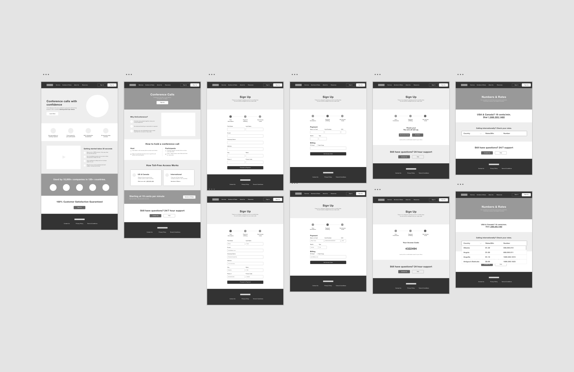
Iteration 1
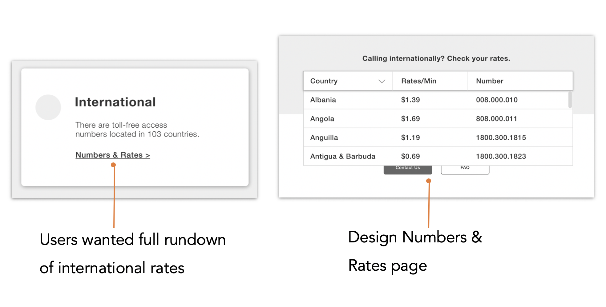
For our final prototype, it was less of an iteration but more about expanding our scope. Through testing multiple rounds, users express frustration in not being able to see clear pricing, both locally and internationally. Therefore, we decided to add a redesign of the pricing page, which ultimately became the Numbers & Rates page. This page makes it easy for users to view all the international countries in one drop down.
Iteration 2
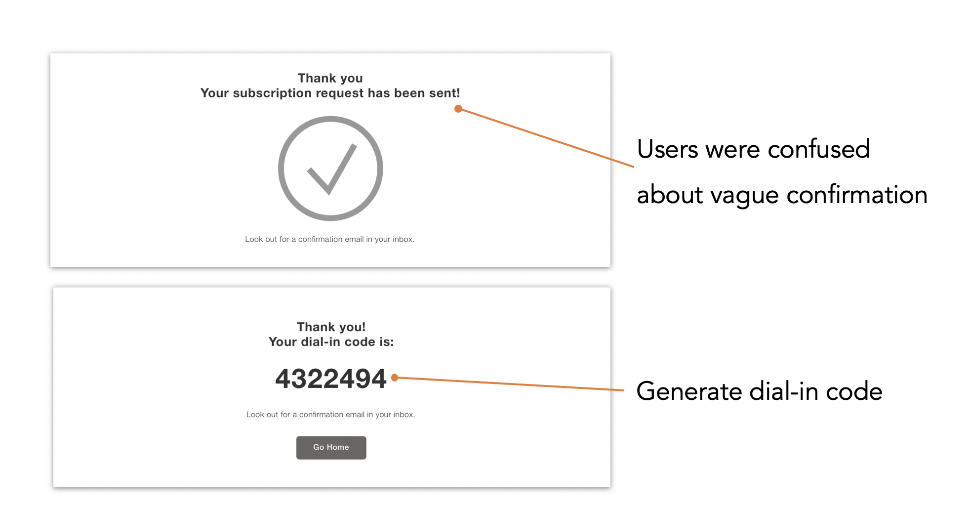
As part of the sign up flow, I created a sign up flow that ends with a confirmation. However, during user testing, users expressed that they would like to be directed to immediate next steps instead of an email. Users would receive their dial in code to be able to get started with their call.
Iteration 3
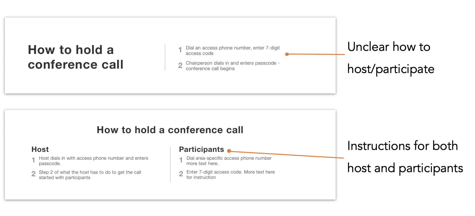
From our first wireframe, I designed the product page to have a “How To” section. The current site’s instructions were unclear in that users were confused as how to start a call as a host, or as a participant.
As a solution, two different types of instructions were outlined, one for the host and one for the participants, so that it fits both party’s needs.

Measuring Success
In order to measure the usability of our design, we asked users to score us on the system usability scale
As you can see, the usability of the existing site starts at a score of 38, which according to the system usability scale, is in an unacceptable range.
The above graph shows the averages from each iteration. It let us know that our redesign was successful in increasing usability, which in turn should increase conversion.
There is a slight fall in the score for our 2nd wireframe due to varying users with different levels of critical review/ expertise, but ultimately our SUS score rose from 38 to 87.
NEXT STEPS
As we completed the 2 week sprint, we began exploring next steps in order to push into launch. Post sprint, the team is continuing to work with OnConference to implement the redesign.
Improve SEO
Work on copywriting/instruction
Mobile responsive
Post-launch conversion data analysis
Show pricing in localized currency