BlueSnap Product Pages
OVERVIEW
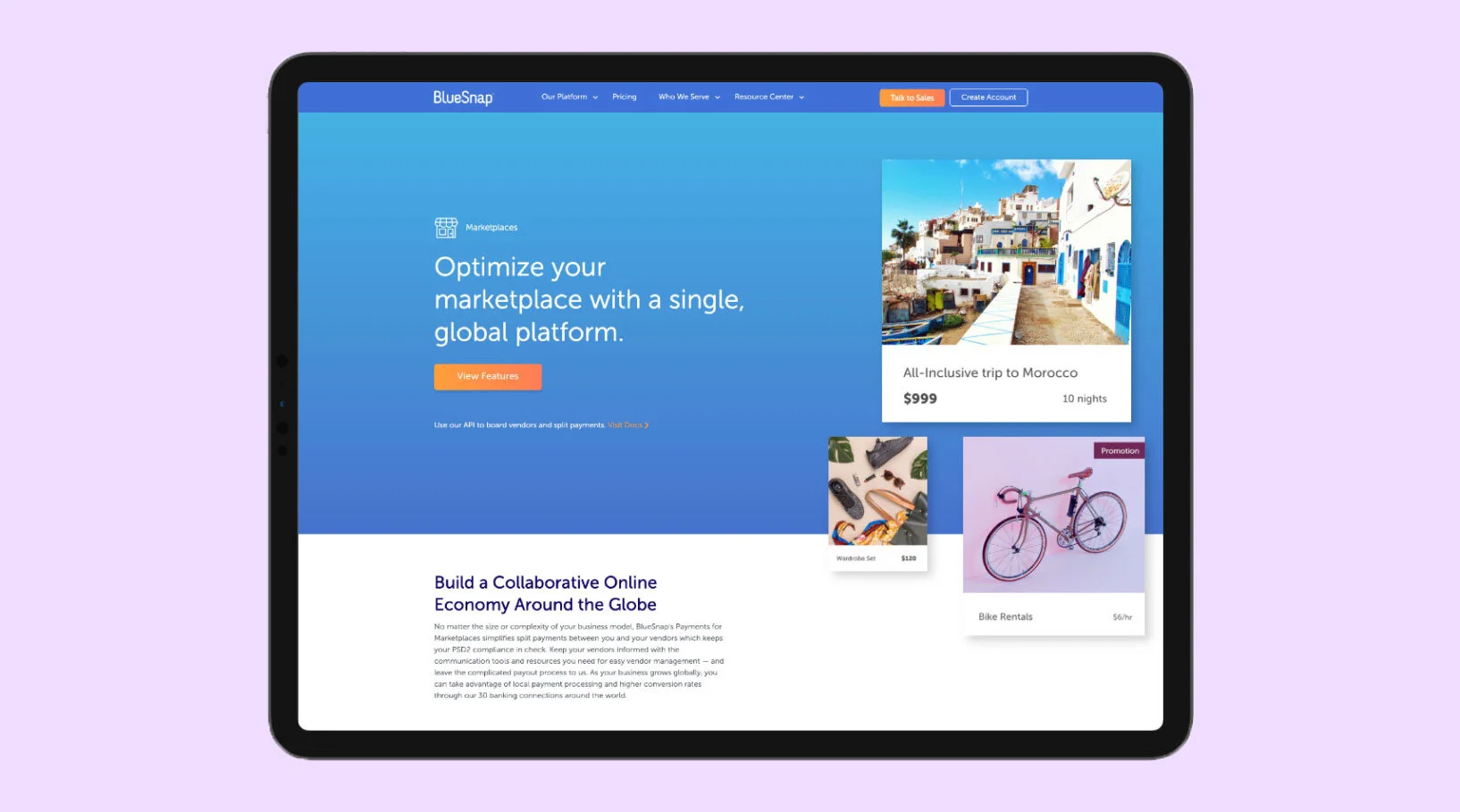
Upon joining the team at BlueSnap, one of the main projects I was to tackle and lead was the product pages redesign. As a payments services company, it is crucial to showcase accurate information about our services.
PROJECT INFORMATION
My Role: UX/UI Designer
Duration: 3 Months
Tools: Sketch, invision, JIRA, WordPress
SCOPE
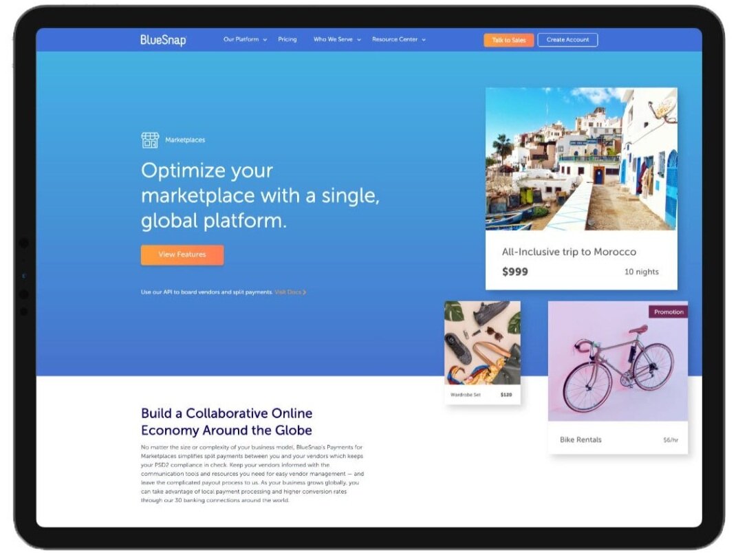
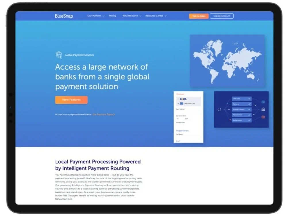
13 Products/Features pages for BlueSnap’s All-in-One Payment Platform
WHY THE REDESIGN?
Some of the reasons were:
Outdated design
Secondary navigation
One long page talking about products/features
Low conversion rates
Users are not scrolling through entirely
STRATEGY & SOLUTION
In collaboration with various departments of the company, it was my job to gather data from our old website and reorganize pages. From icons to infographics, I fully owned the designing process at BlueSnap for this project.
As the product pages being possibly the most crucial portion of the site, the process of the research was important.
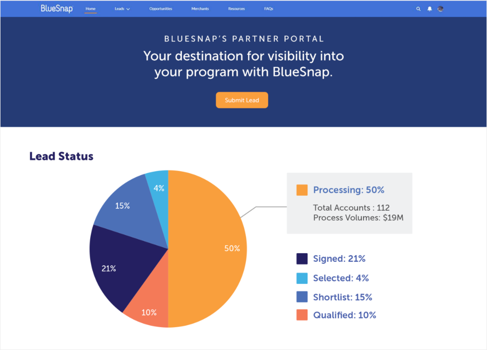
This graphic is an example of the lead status on the BlueSnap partner portal. With the brand colors, the diagram showcases how there are different types of leads.
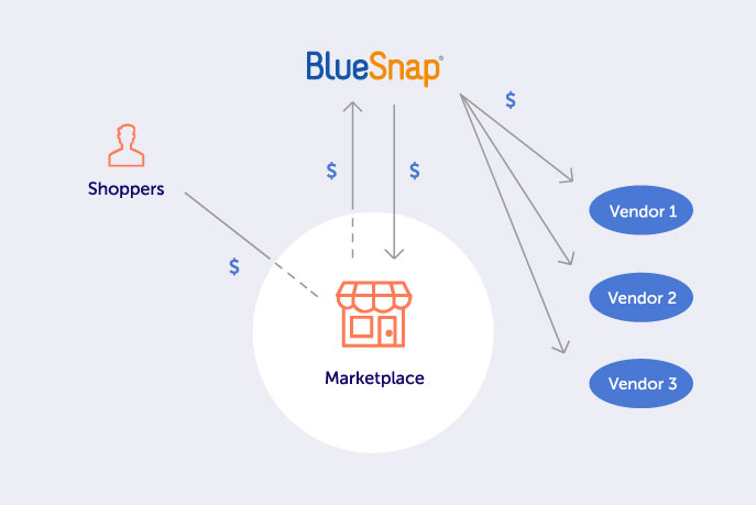
This infographic portrays the journey of how money flows from the shoppers to the vendors. Icons were used for the simplistic view for the viewers’ ease. This graphic lives on the Marketplaces product page.
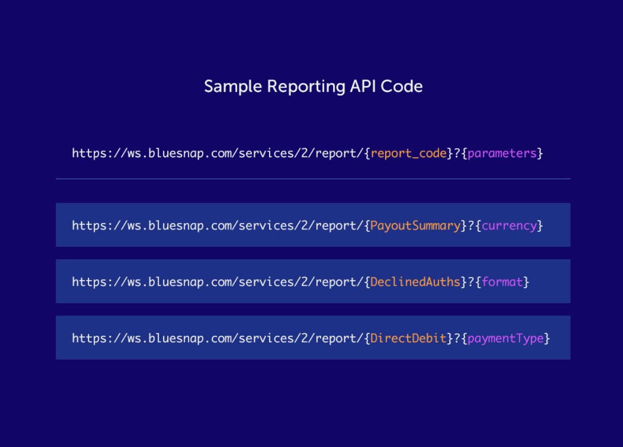
This is an example of the BlueSnap Reporting APIs. Top line outlines the template API, and three below show variations. Vibrant color palette is used to highlight customizable content.