Keurig admin portal
using visualization to translate complex data
OVERVIEW
The Keurig 4500 is a coffee brewer for corporate office settings. While there is a consumer facing interface utilized to make beverages, the Admin Portal is the backend data visualization tool for technicians and office managers to access brewer administrative settings. Prior to the brewer’s public launch, the Admin Portal interface needed a user friendly redesign.
PROJECT INFORMATION
Timeline: 3 months
Team: Product Manager, Software Engineer (3), UX Researcher
Role: Lead UX Designer
Tools: Sketch, QT Design Studio, AutoCAD
design process
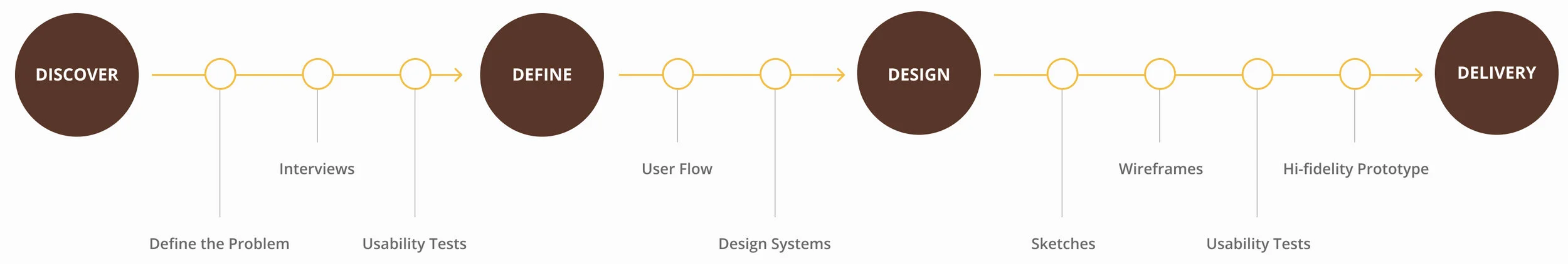
identifying the problem
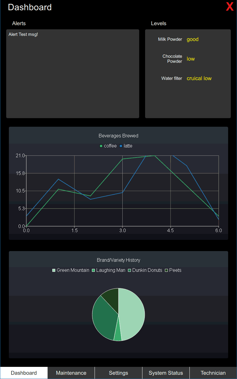
Our team identified that the existing Admin Portal design was barely functional and far from being user friendly. The previous interface was laid out in a skeleton format by software and mechanical engineers.
We knew that this interface needed to exist and be user friendly, but was still missing a lot of information and components.
strategy & solutioN
We needed to collaborate cross-functionally with teams such as Cloud, IoT, and Mechanical Engineering in order to figure out the necessary requirements that were not easily accessible.
Once we gathered enough information, we worked on iterating the existing design in order to better the usability for technicians and office managers.
interviews
user interviews
Our researcher conducted 10 user interviews across Keurig technicians and corporate office managers to understand their needs.
stakeholder interviews
A second set of interviews was conducted across Cloud, IoT, and Mechanical Engineering to understand further technical needs.
key takeaways
Lack of hierarchy
Issues with current UI
User and stakeholder interviews overlapped/did not
contextual inquiry
Our team also conducted contextual inquiries on the existing interface. There was not much to test because so much information was missing. Based on the user feedback, we were able to better identify the key pain points of this current design.
DESIGN PAIN POINTS
Text heavy, without hierarchy
Color usage
Lack of context/technical information
technical language is not intuitive
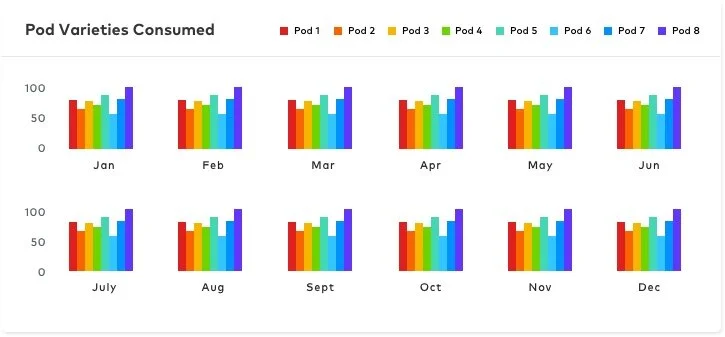
too much data for certain parts (graph)
User flows

office manager

Technician

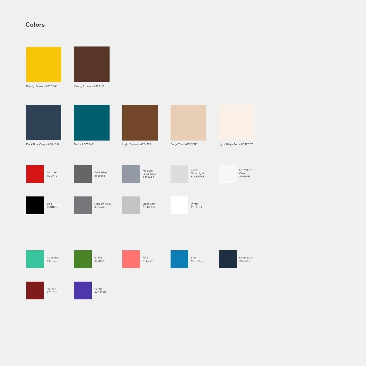
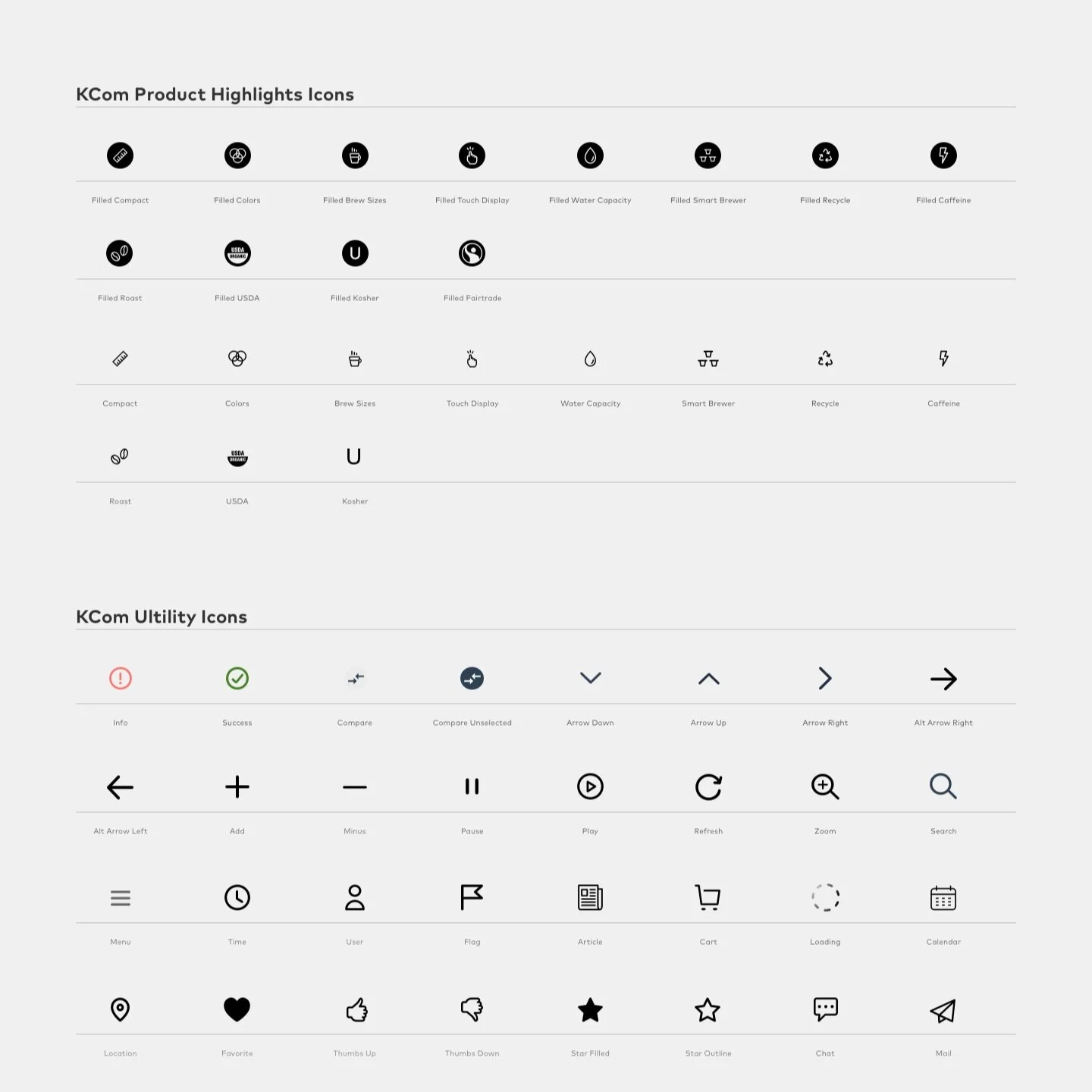
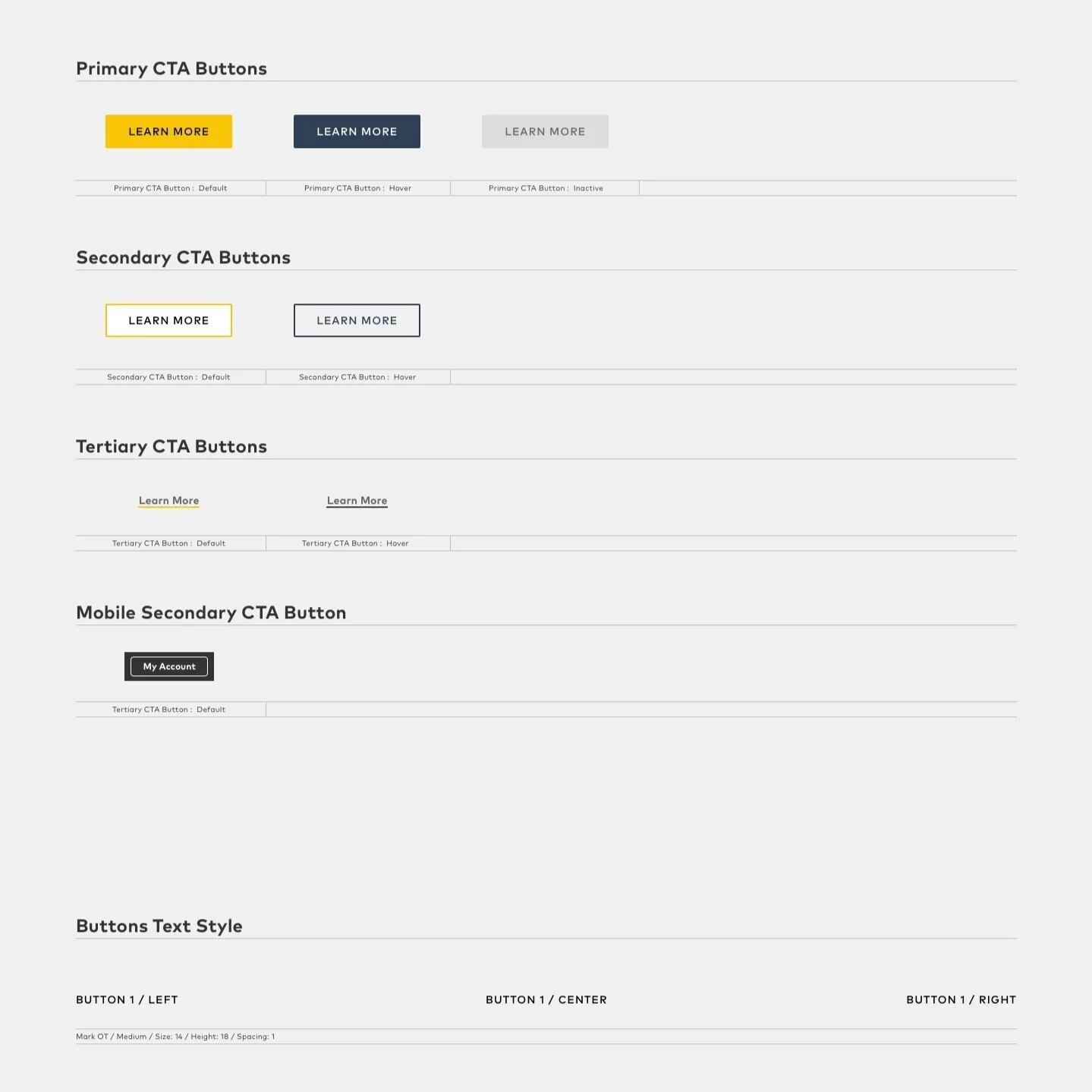
usage of Keurig Design Systems
In order maintain design and brand consistency, utilizing our existing Keurig Design Systems was an essential part of the design planning process.
SKetching & wireframing
Utilizing the research synthesis and current design systems, I sketched out a few design explorations.
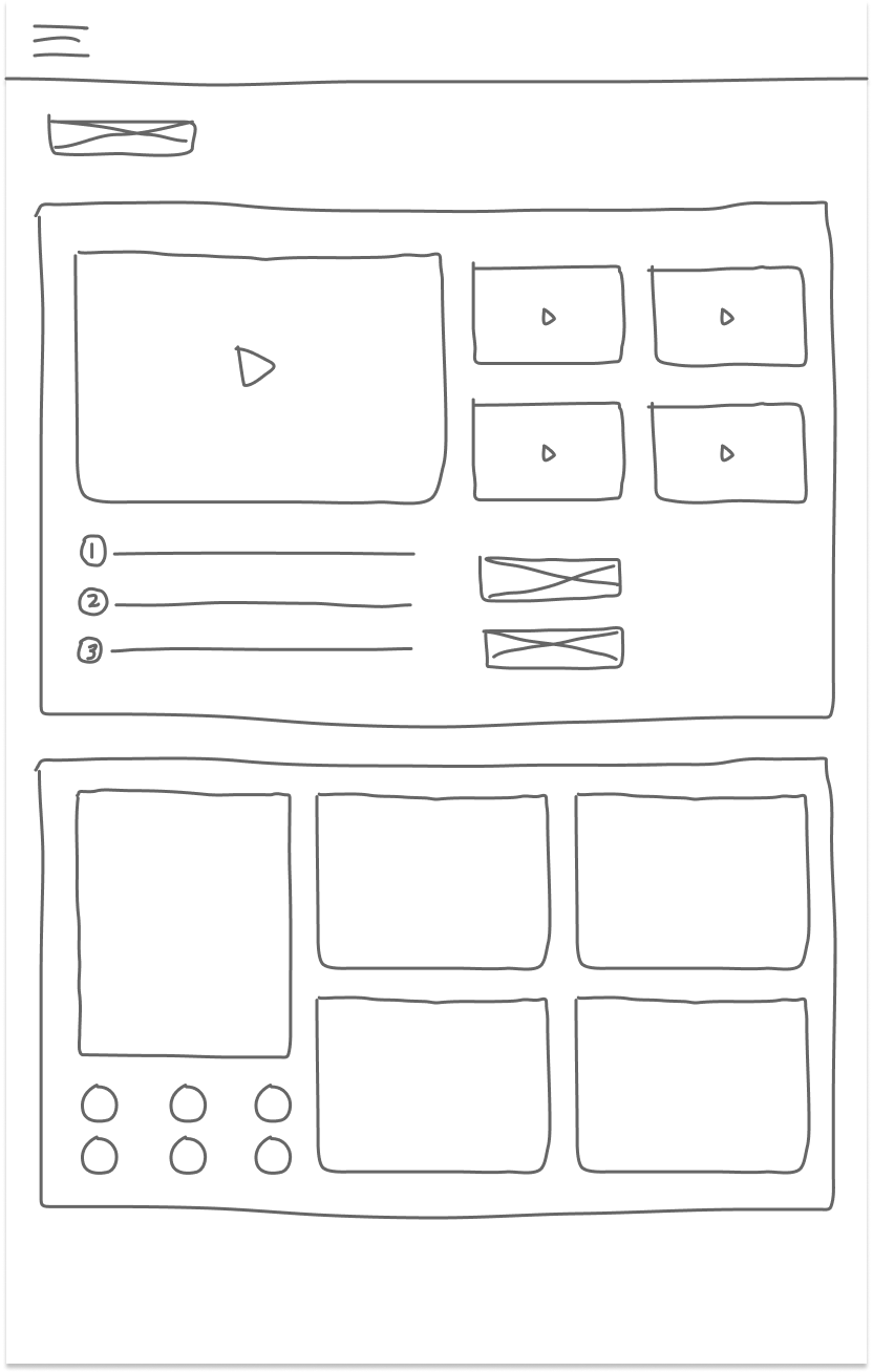
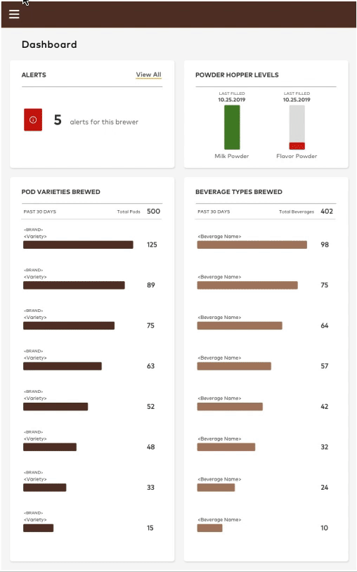
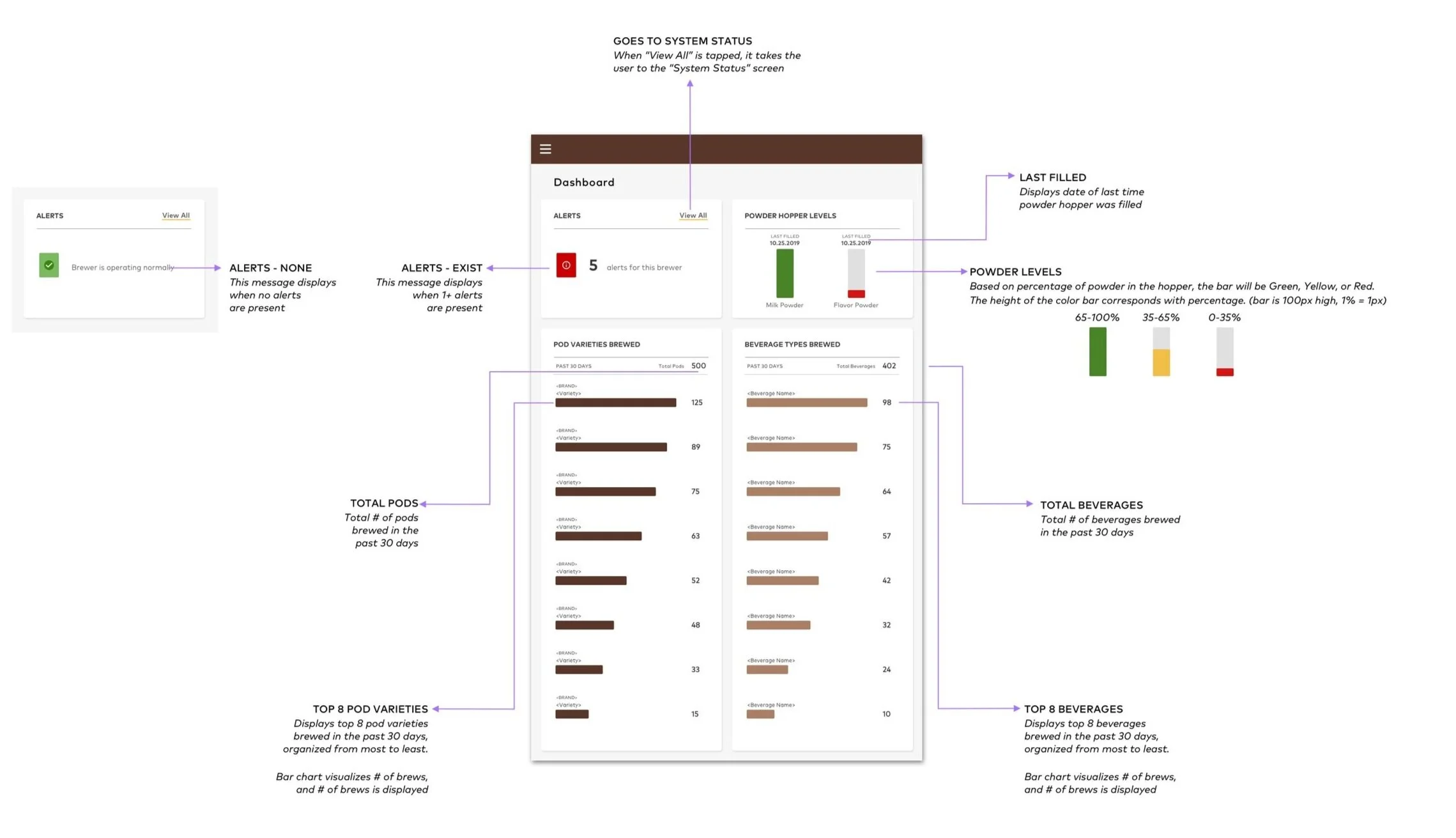
Dashboard
Settings
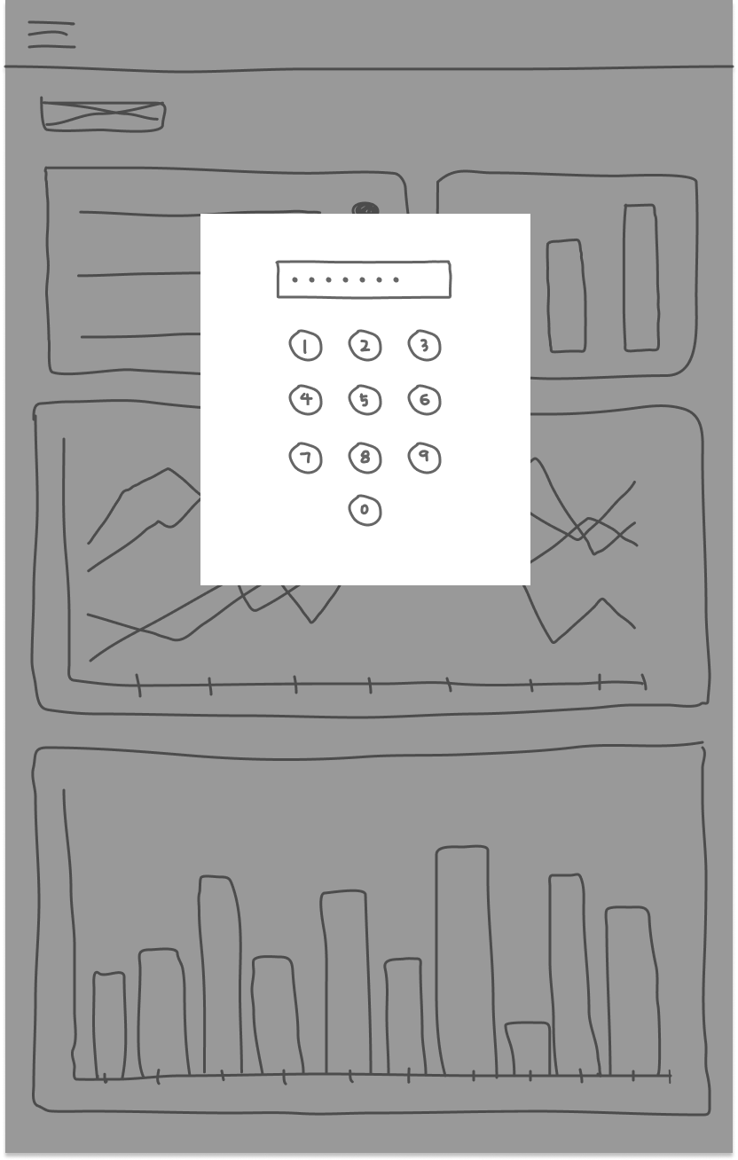
Password
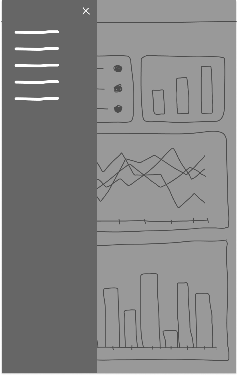
Menu
Design explorations and iterations
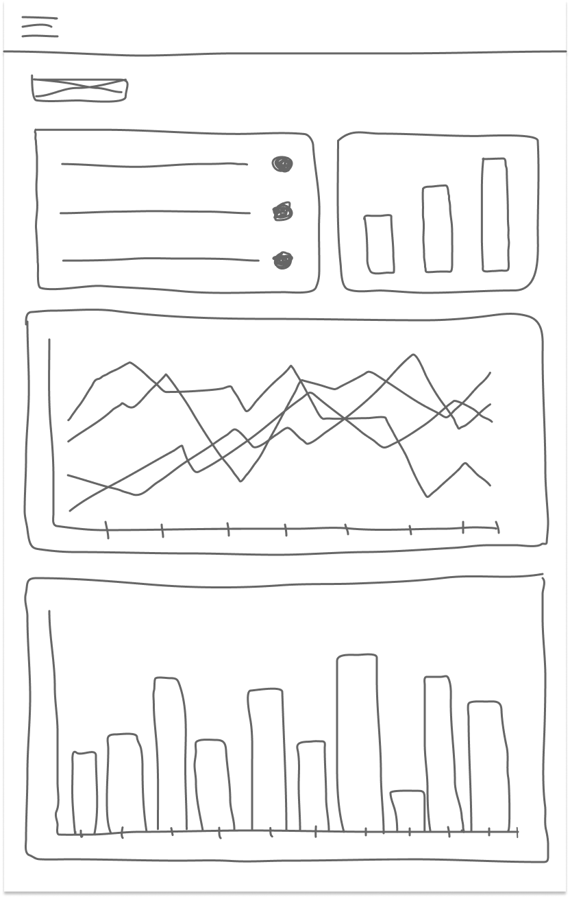
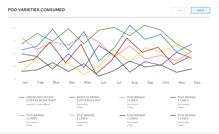
Out of all the design pain points, one particular design problem that we had was around the graphs on the dashboard. There was too much info that we wanted to showcase, but the data was overwhelming.
With that, I was able to explore some ways to properly visualize the data, and presented to the team. The team agreed that we needed to take a different route.
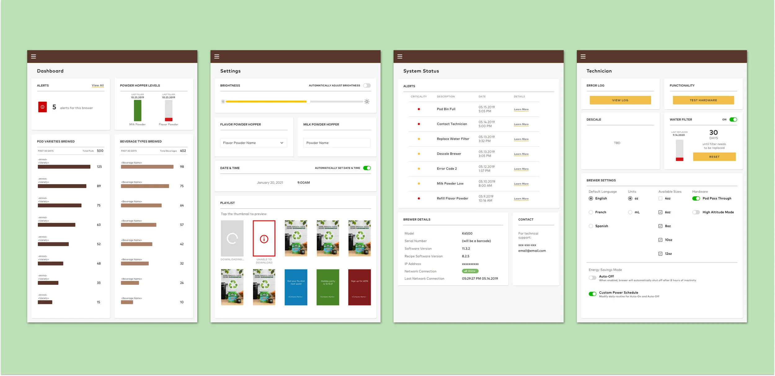
Final designs
reflections
Designing for a non-customer facing audience can come with difficulties. Collaborating with with mechanical engineers can be foreign, so it takes time to understand all the ins and outs of the system and patience (and thinking outside of the box). It’s easy to be frustrated without knowing all the ins and outs before designing, but sometimes it’s a skill to leave spaces for tba information, and be able to embed them when the information is provided. (the team never worked with an internal designer prior to this project, pm and engineering did not did have have documentation for requirements, did not understand a lot of the hardware technology, remote work for physical hardware)